The Design Practice of Matthew Smith
I’m a Brooklyn based designer working closely with Louise Fili as her Associate and as a Partner at Tipofili. After nearly six years, I am looking for what’s next.
Thank you to everyone that got in touch! As of May 2023, I am now working as a Senior Designer at High Tide.
-
Introduction
1 -
What I am looking for
2 -
Work Samples
3 -
Makeshift Tools
4 -
Type Design
5 -
Thank You & Colophon
6 -
Contact
7 -
Résumé
↗
Introduction
I’m Matthew Smith, and I’m a design generalist. Since 2017, I have been working closely with Louise Fili as her Senior Designer and Associate, and in 2022 we co-founded Tipofili, the studio’s complementary foundry for custom and retail fonts. I have also been running Morning Type since 2020, and have been maintaining the TypeFoundry.Directory since 2018.
If you want my whole backstory, my about page features a slider where you can determine exactly how much detail you’re willing to read. Or if you are just interested in the work related stuff, I’d suggest reading my résumé.
What am I looking for exactly?
In short, meaningful work. As a brand designer at a very small studio, I have cultivated a wide range of skills and tend to refer to myself as a generalist with a keen eye for typography, insight into historical reference and research, and a passion for technology. Now I want to apply those skills to meaningful projects.
What I am really looking for is a challenge—for a team that considers projects in a holistic fashion and not just from the perspective of visual design. For a team that advocates for sustainable business practices. For a team that isn’t driven by predefined scopes but rather is guided by goals and purpose. For a team that is interested in new ideas and cares deeply about quality. For a team that trusts and supports each other.
Work Samples
A professor of mine once told me, “We’ll go almost anywhere with you in a poem if you present us with a chair to sit in.” I think about this a lot, and over the years it has really informed my design process. I am interested in creating brands that feel transportive and immersive, looking at design beyond problem solving, and most of all preserving the poetry.
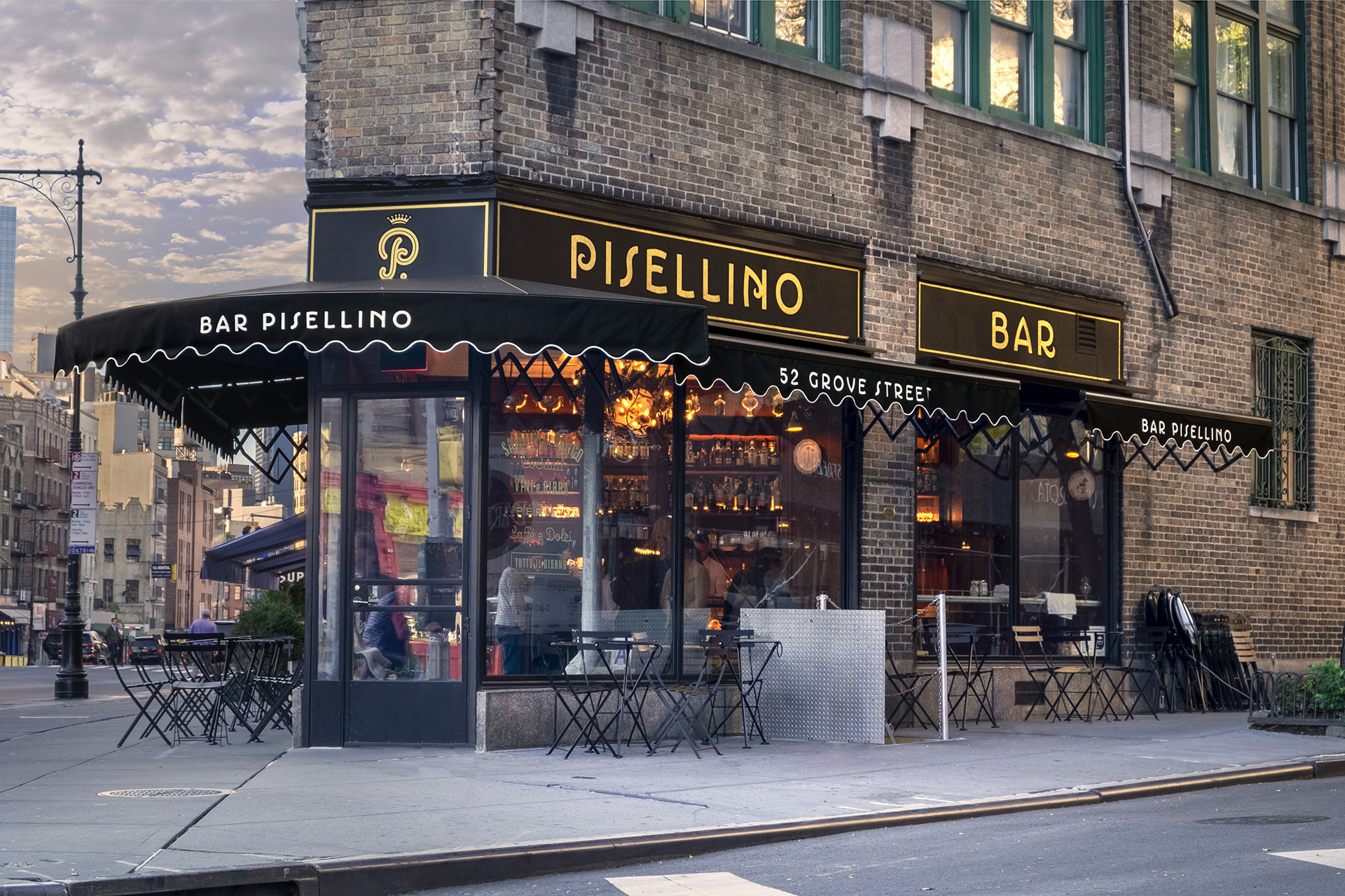
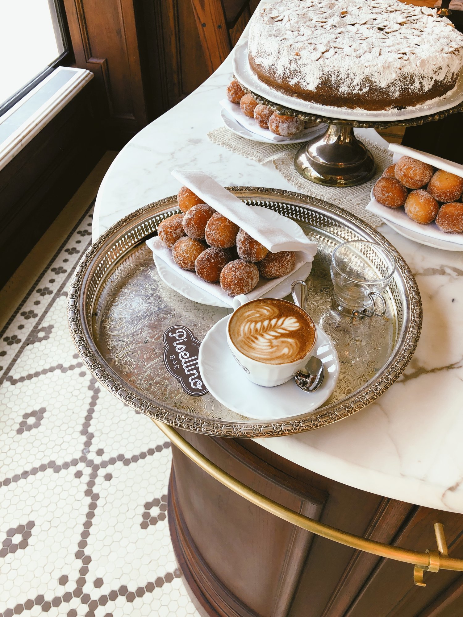
Client: Pisellino
Studio: Louise Fili Ltd
Art Direction: Louise Fili
Design: Louise Fili and Matthew Smith
Details: Signage
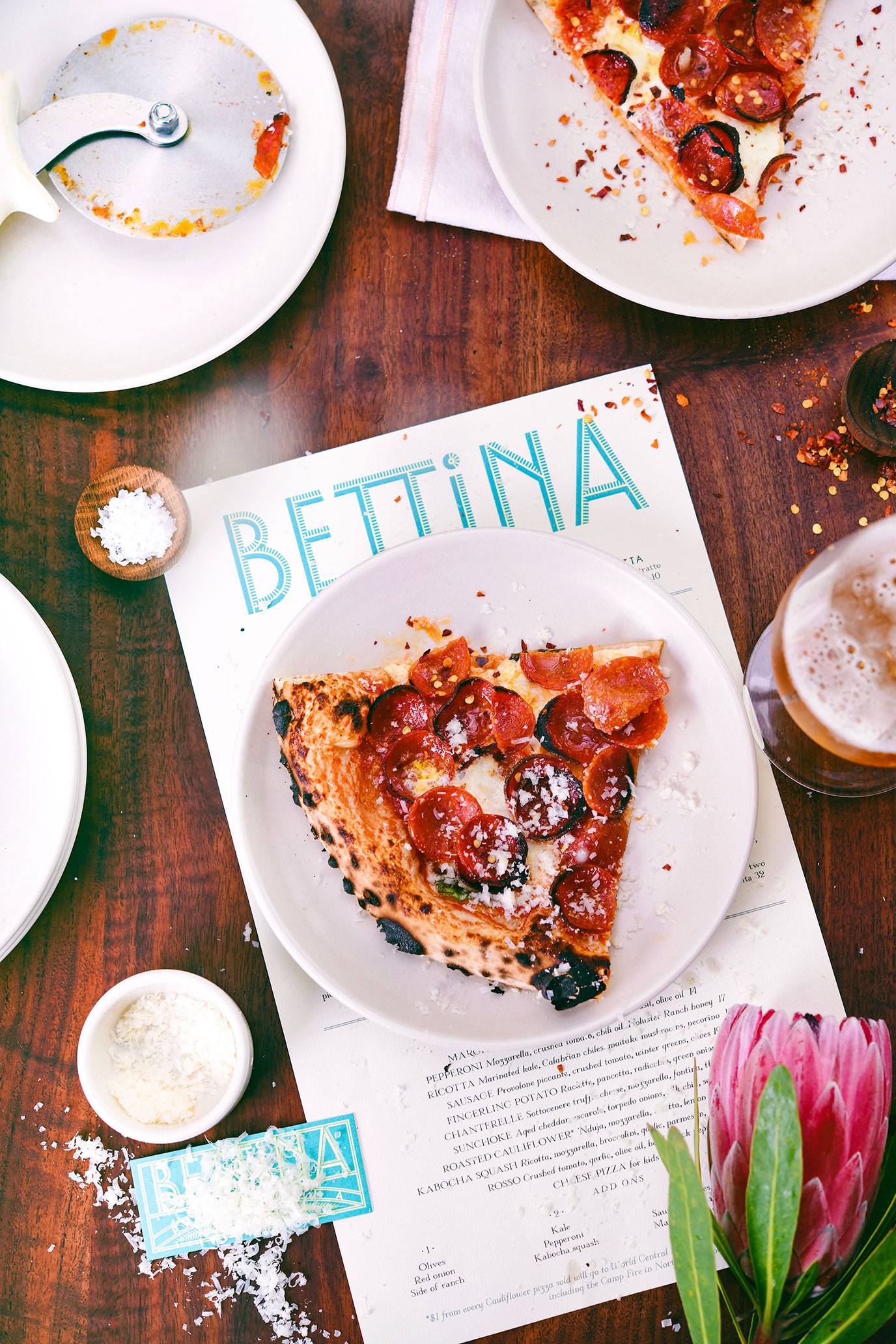
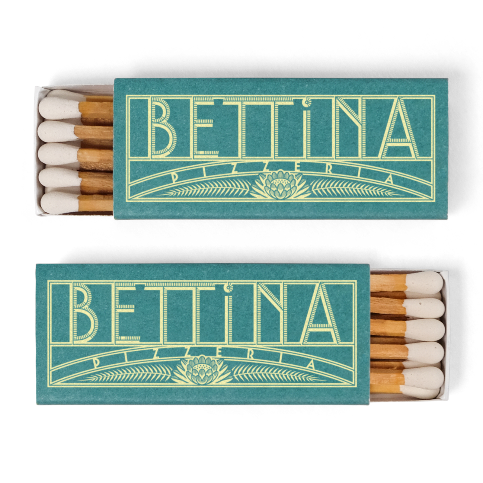
Client: Bettina
Studio: Louise Fili Ltd
Art Direction: Louise Fili
Design: Louise Fili and Matthew Smith
Details: Branding
Client: Pisellino
Studio: Louise Fili Ltd
Art Direction: Louise Fili
Design: Louise Fili and Matthew Smith
Details: Packaging
Client: Personal
Details: Lettering
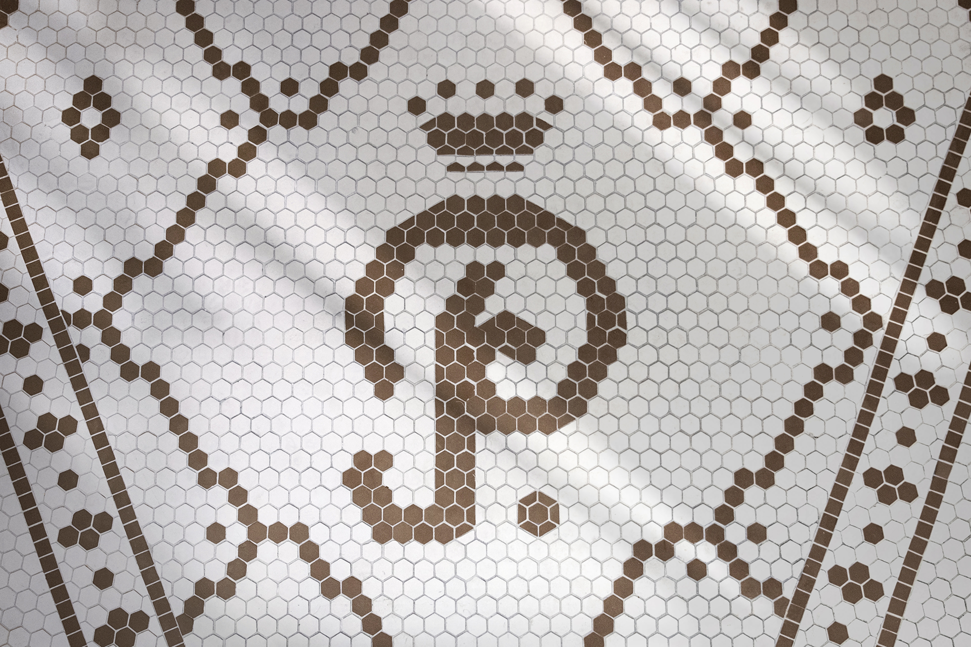
Client: Pisellino
Studio: Louise Fili Ltd
Art Direction: Louise Fili
Design: Louise Fili and Matthew Smith
Details: Branding
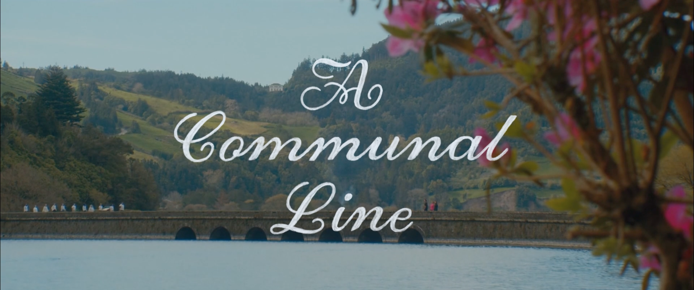
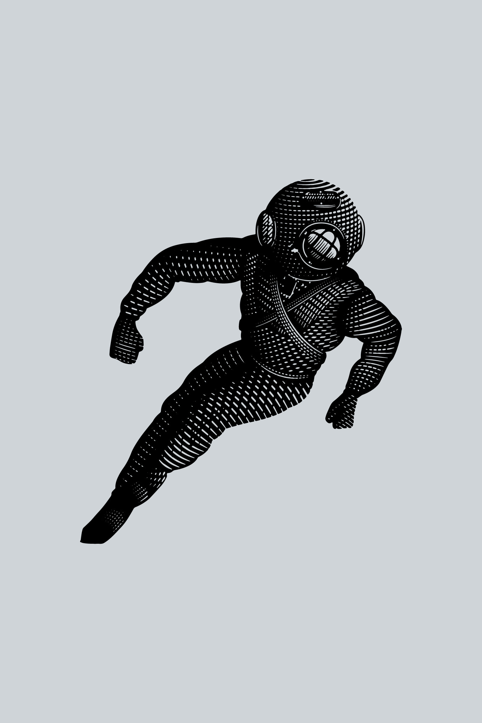
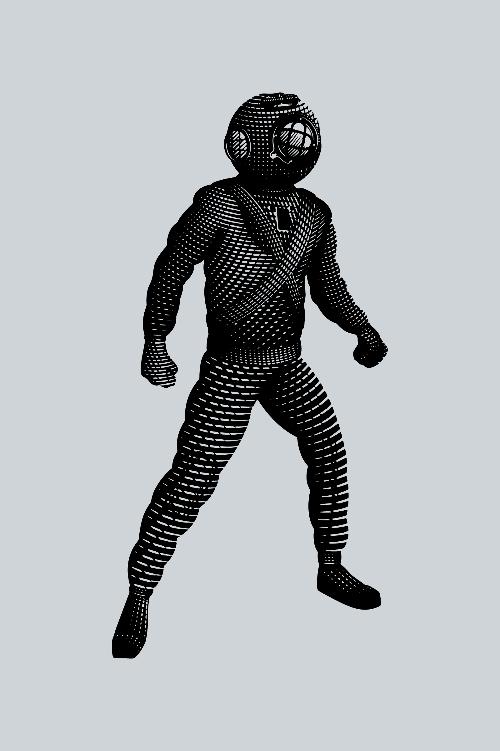
Client: Andrew Herzog
Details: Title lettering for “A Communal Line”

Client: Suri & Co.
Studio: Louise Fili Ltd
Art Direction: Louise Fili
Design: Louise Fili and Matthew Smith
Details: Monogram
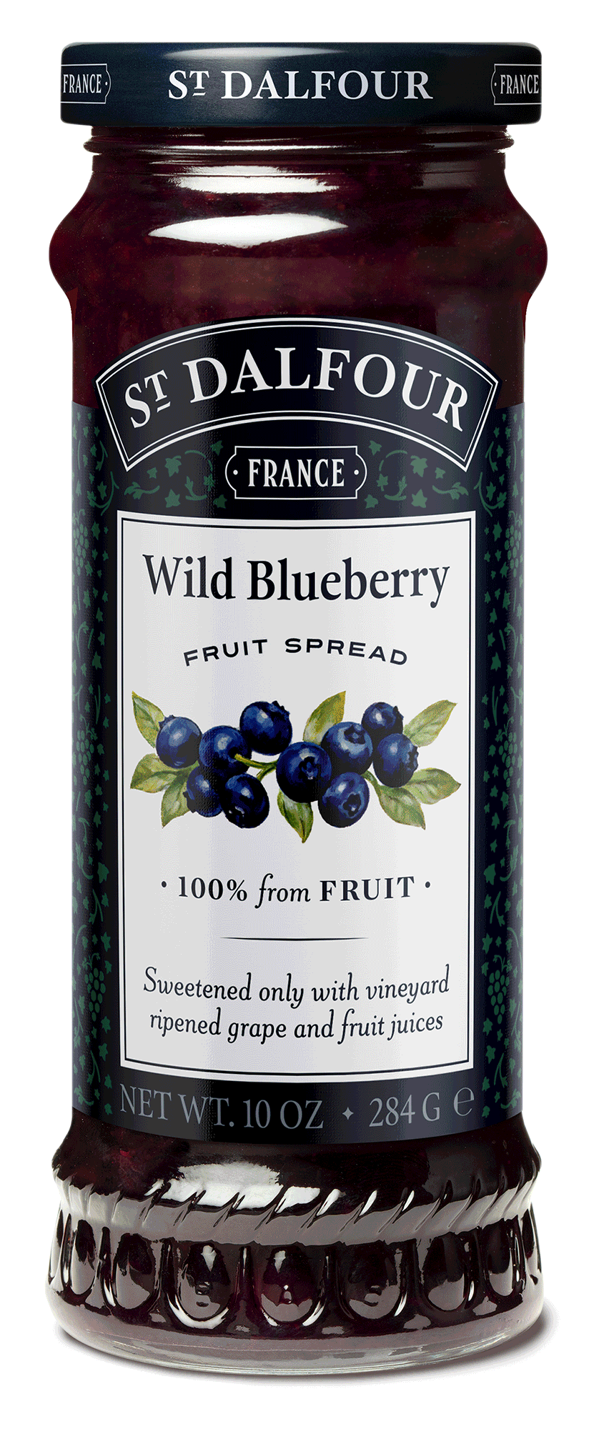
Client: St. Dalfour
Studio: Louise Fili Ltd
Art Direction: Louise Fili
Design: Louise Fili, Andy Anzollitto, and Matthew Smith
Details: Rebrand, Packaging
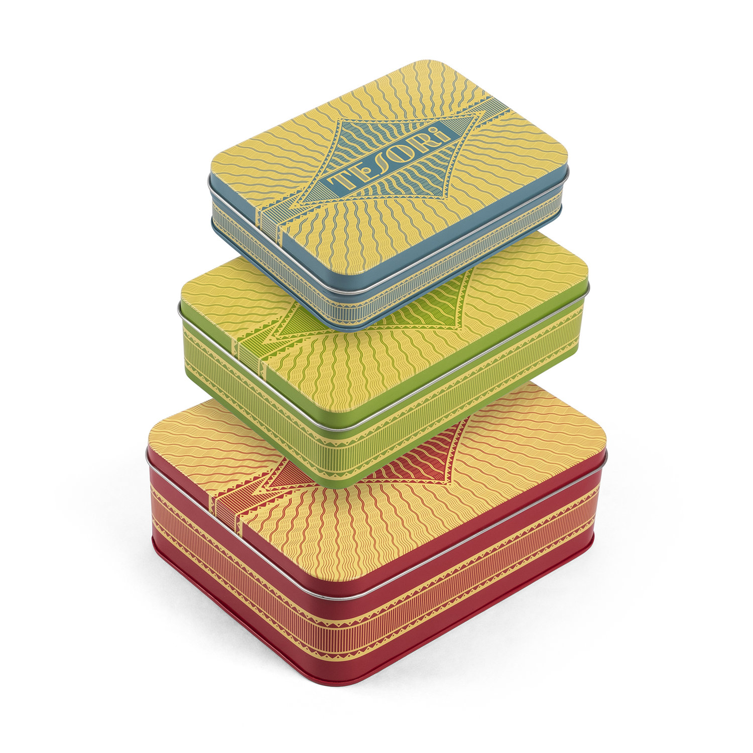
Client: Princeton Architectural Press
Studio: Louise Fili Ltd
Art Direction: Louise Fili
Design: Louise Fili and Matthew Smith
Details: Illustration, Lettering, Packaging
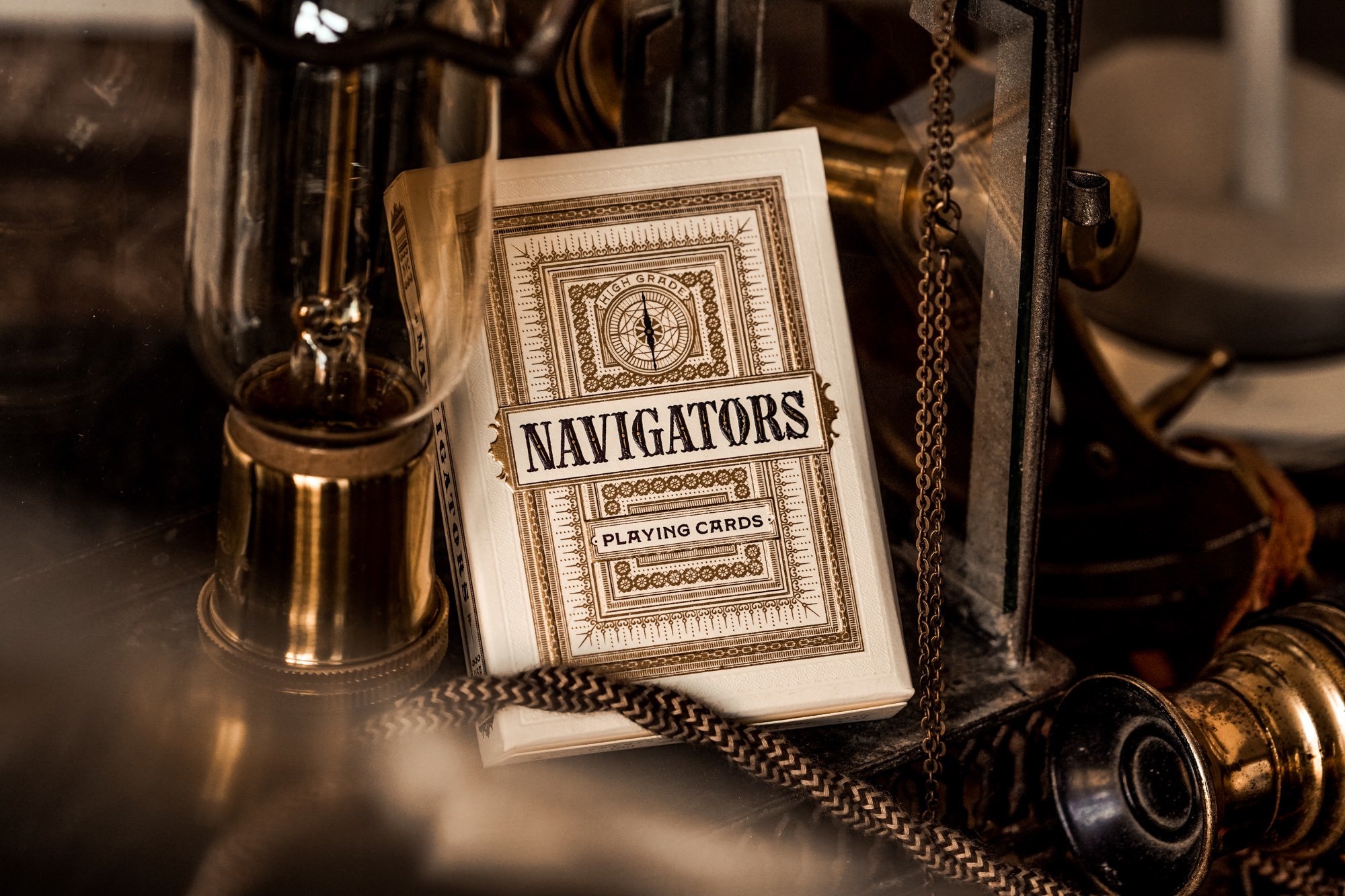
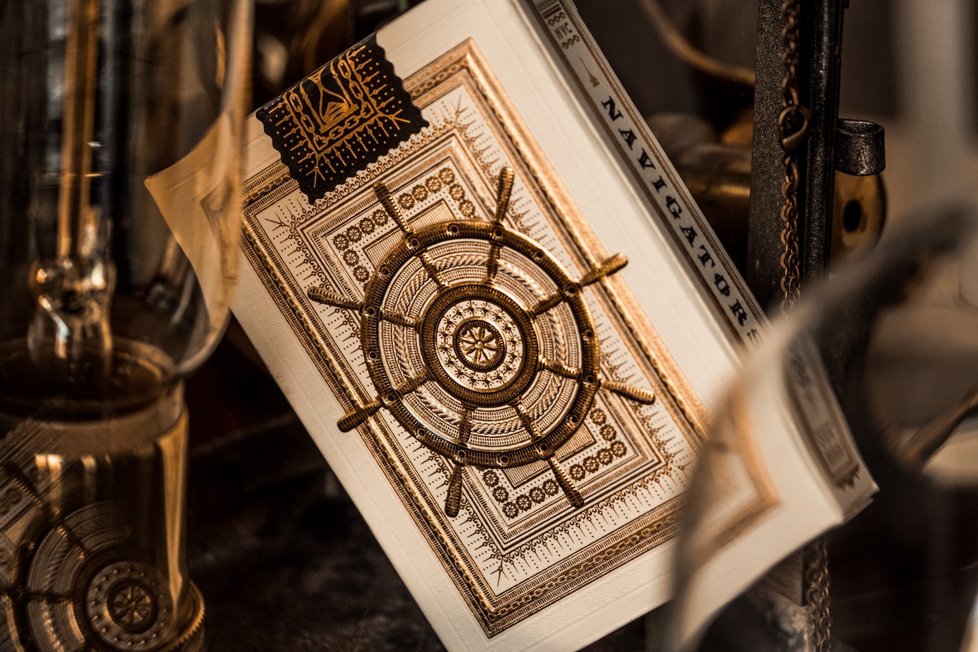
Client: Theory11
Project: Navigator Playing Cards
Details: Illustration, Lettering, Packaging
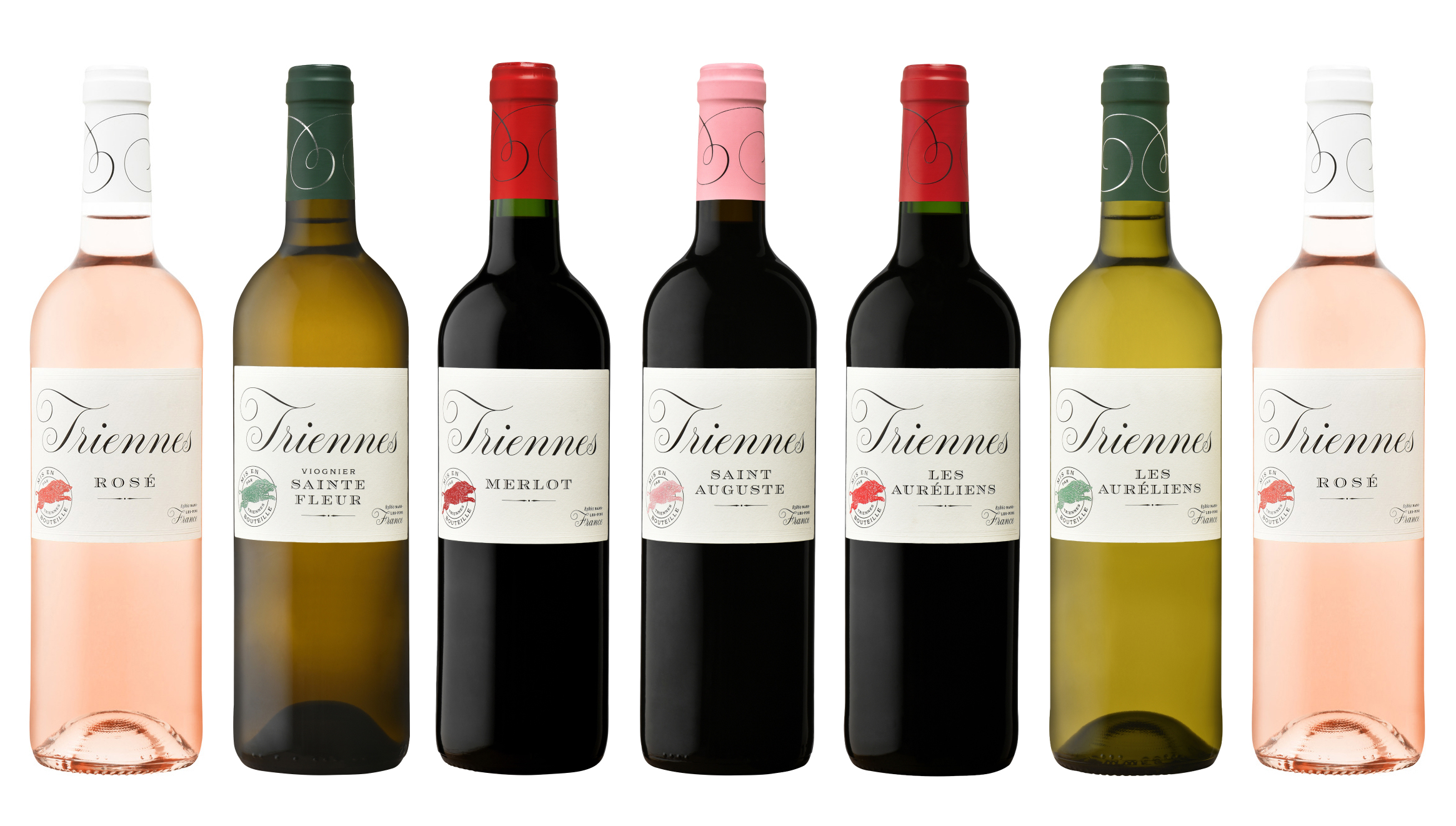
Client: Triennes
Studio: Louise Fili Ltd
Art Direction: Louise Fili
Design: Louise Fili and Matthew Smith
Details: Branding, Packaging
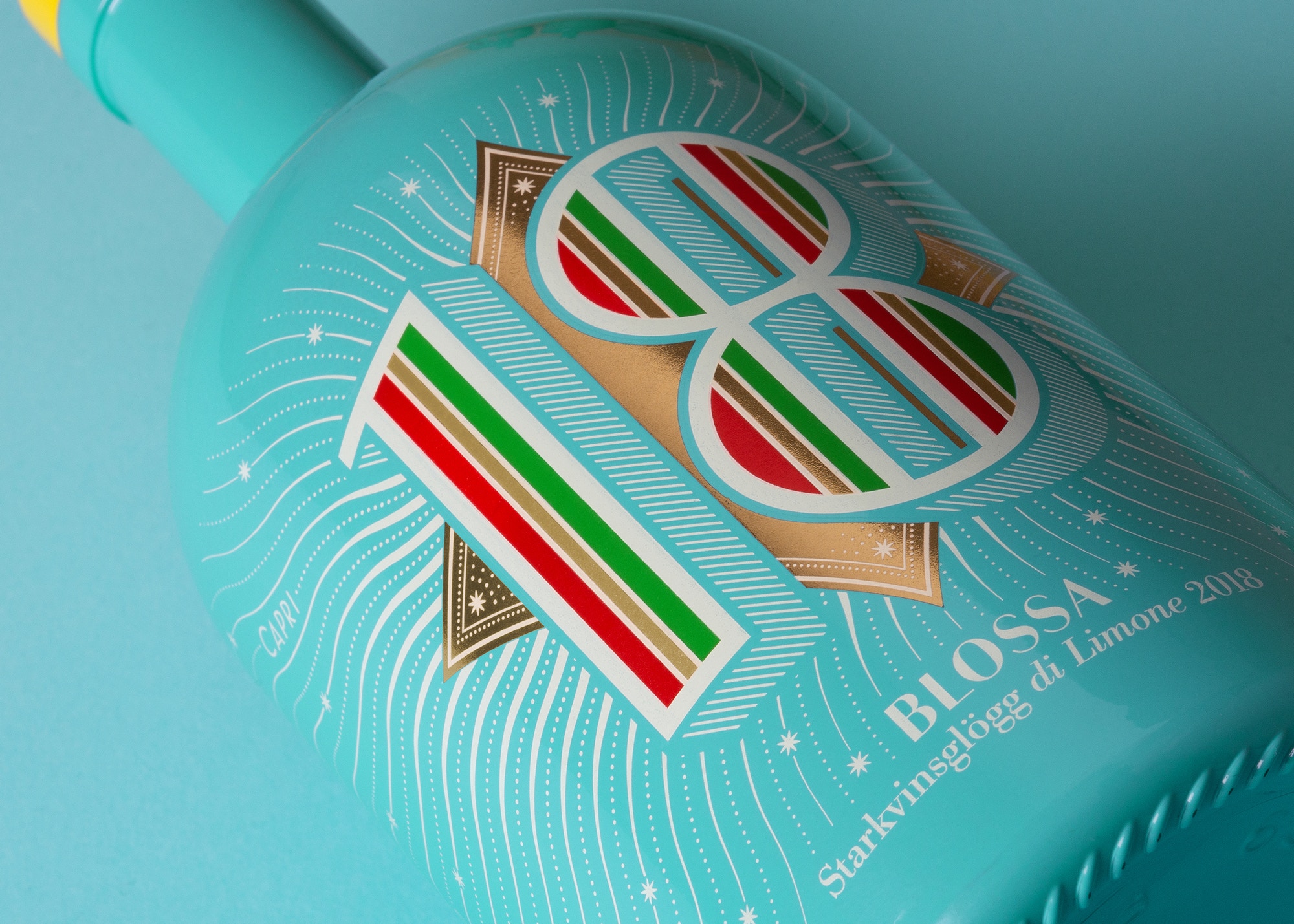
Client: Vieux Vins Group
Studio: Louise Fili Ltd
Art Direction: Louise Fili
Design: Louise Fili and Matthew Smith
Details: Branding, Motion Design
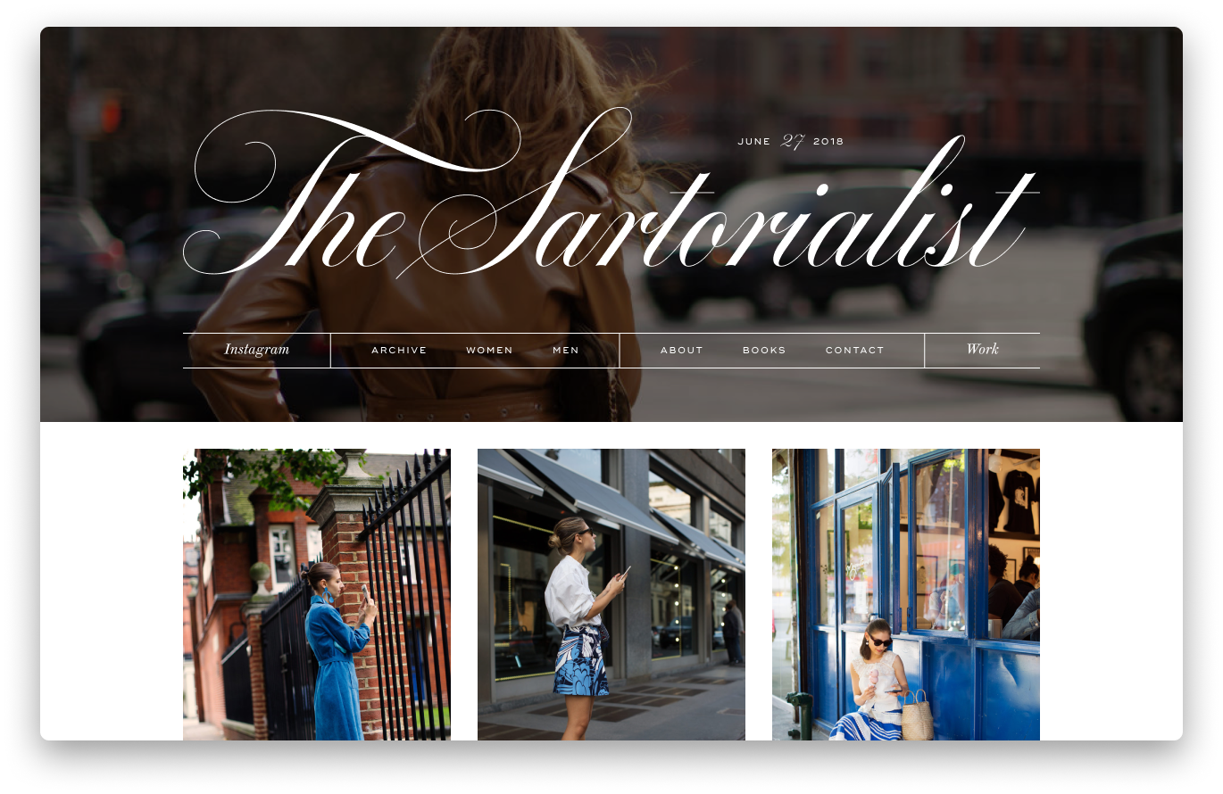
Client: The Sartorialist
Studio: Louise Fili Ltd
Art Direction: Louise Fili
Design: Louise Fili, Nick Misani, and Matthew Smith
Details: Branding, Lettering, Web Design
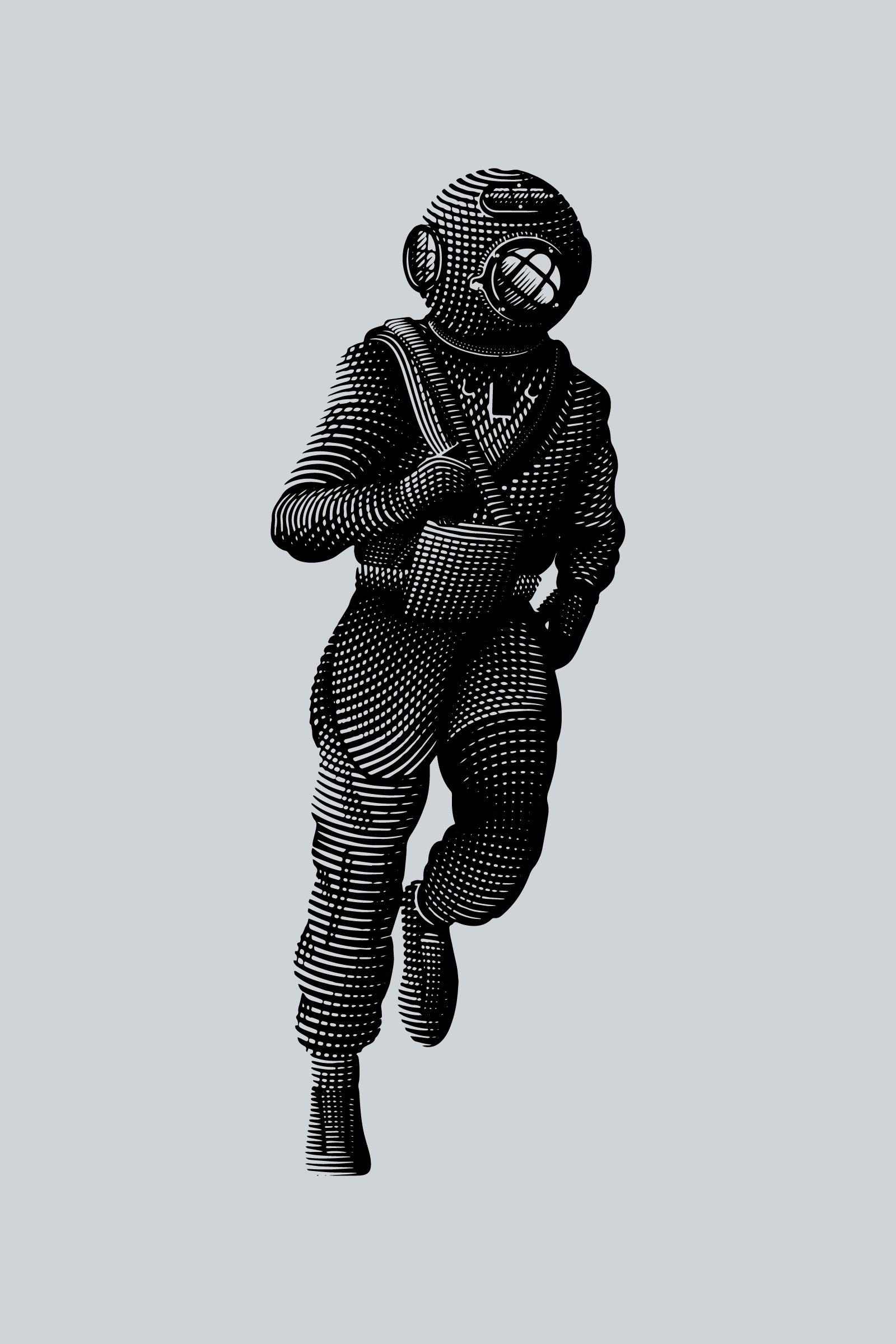
Client: Pacific
Details: Illustration
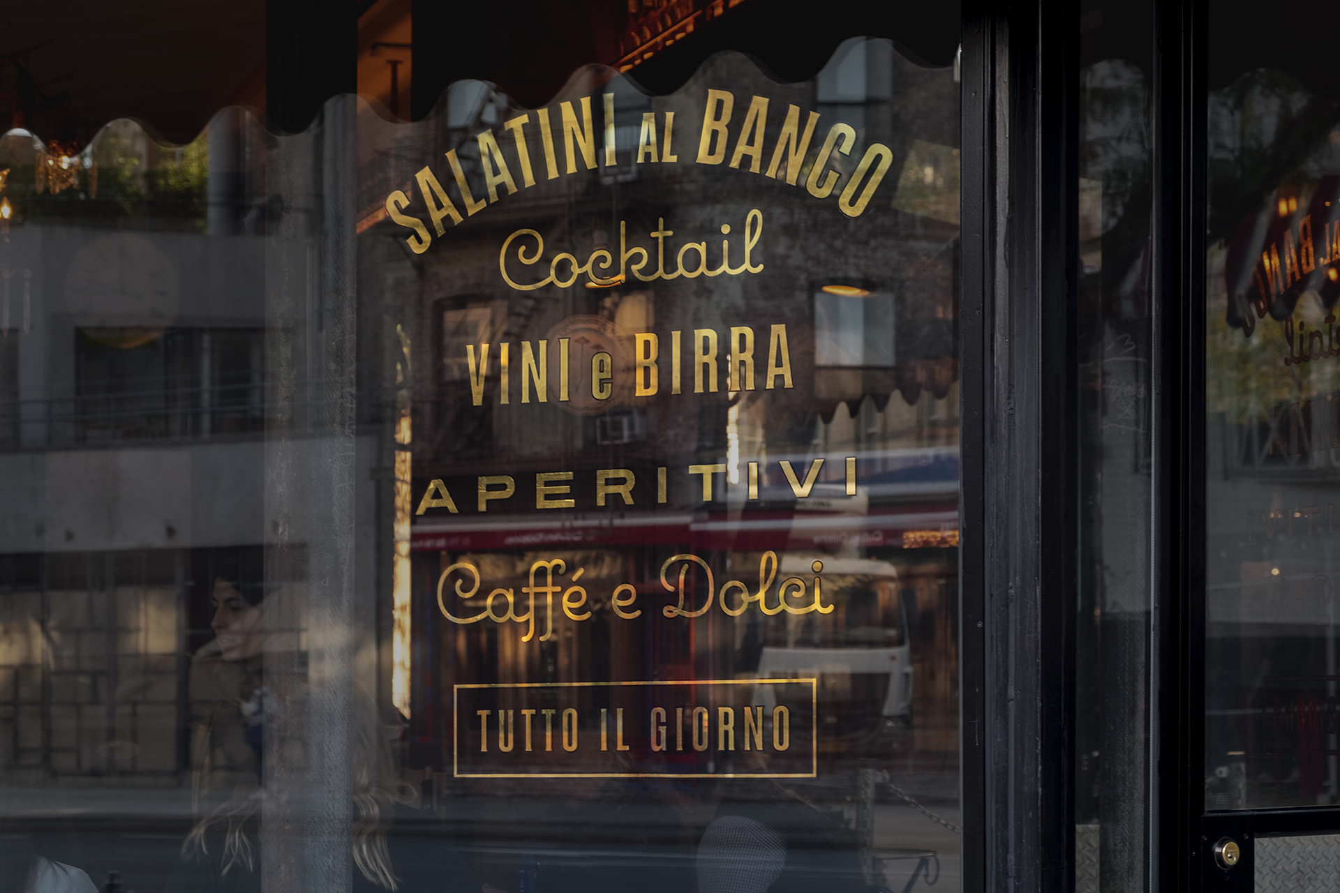
Client: Pisellino
Studio: Louise Fili Ltd
Art Direction: Louise Fili
Design: Louise Fili and Matthew Smith
Details: Branding, Signage
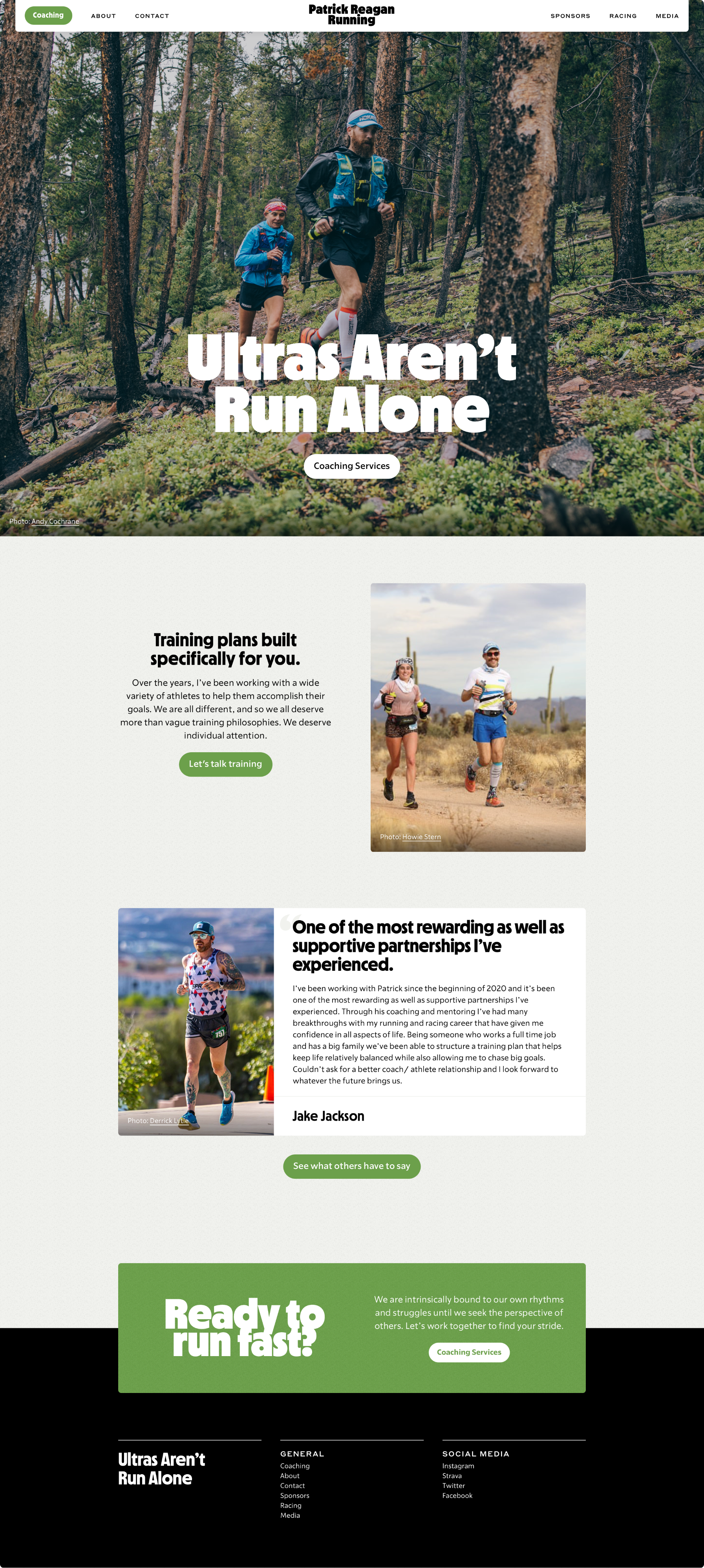
Client: Patrick Reagan Running
Details: Web Design, Web Development
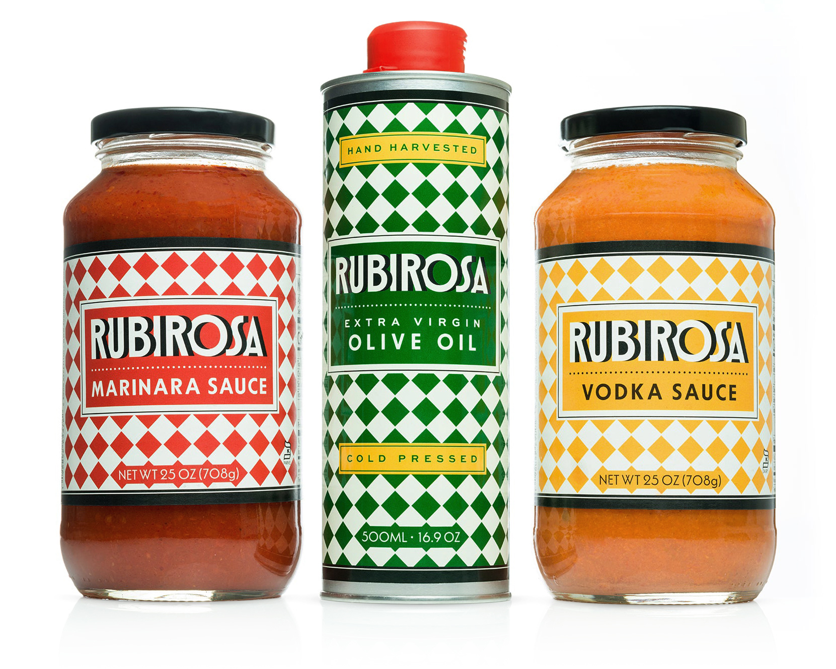
Client: Rubirosa
Studio: Louise Fili Ltd
Art Direction: Louise Fili
Design: Louise Fili and Matthew Smith
Details: Branding, Packaging
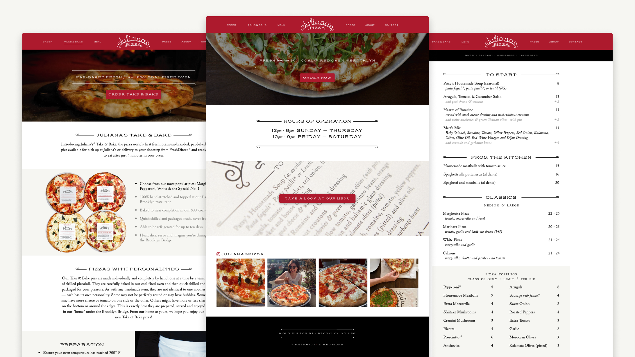
Client: Juliana’s
Studio: Louise Fili Ltd
Art Direction: Louise Fili
Design: Louise Fili, Andy Anzollitto, and Matthew Smith
Details: Web Design, Front-end Development
Client: Pantheon
Art Direction: Nick Misani
Details: Book Cover, Custom Type
Client: Pisellino
Studio: Louise Fili Ltd
Art Direction: Louise Fili
Design: Louise Fili and Matthew Smith
Details: Branding
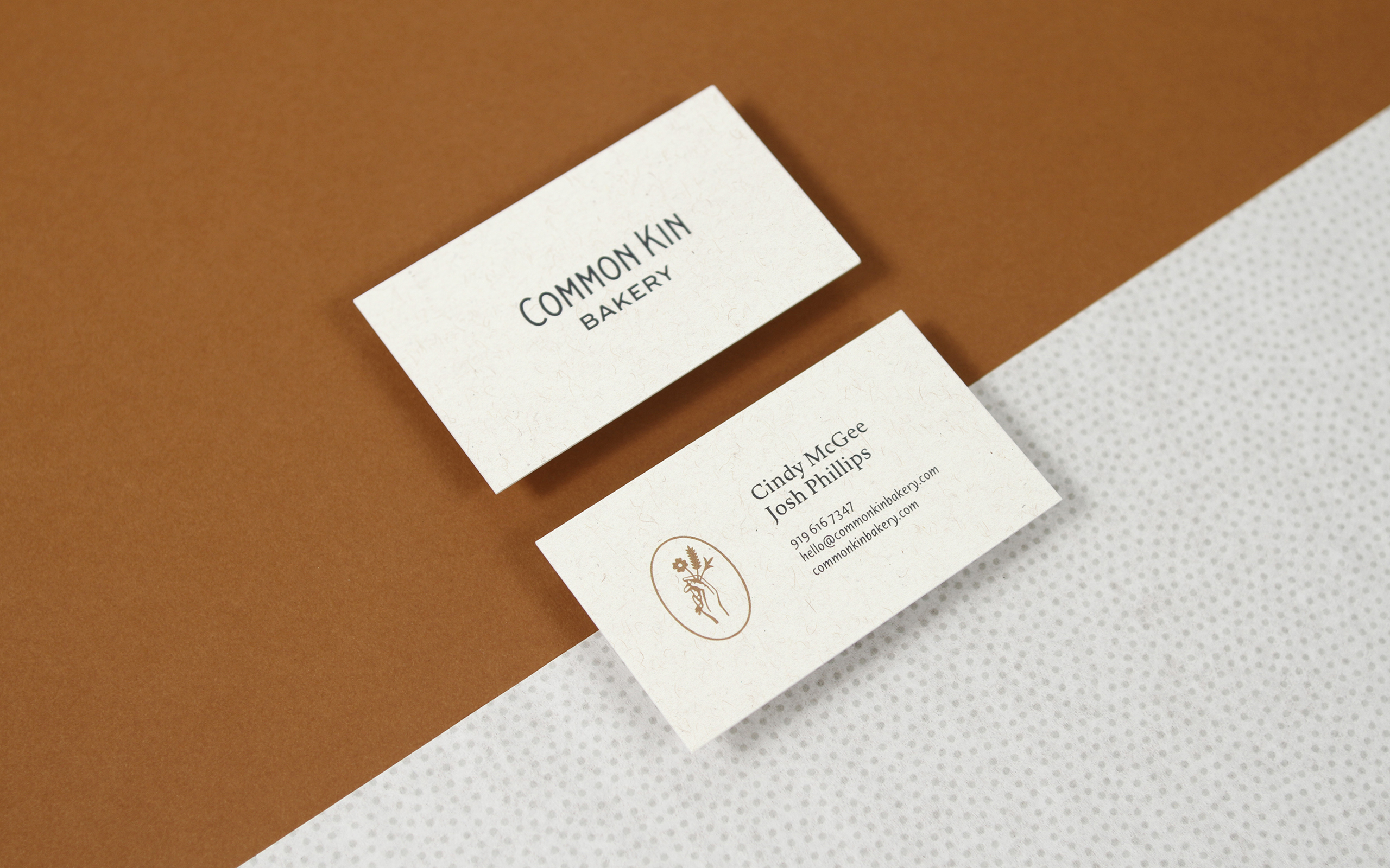
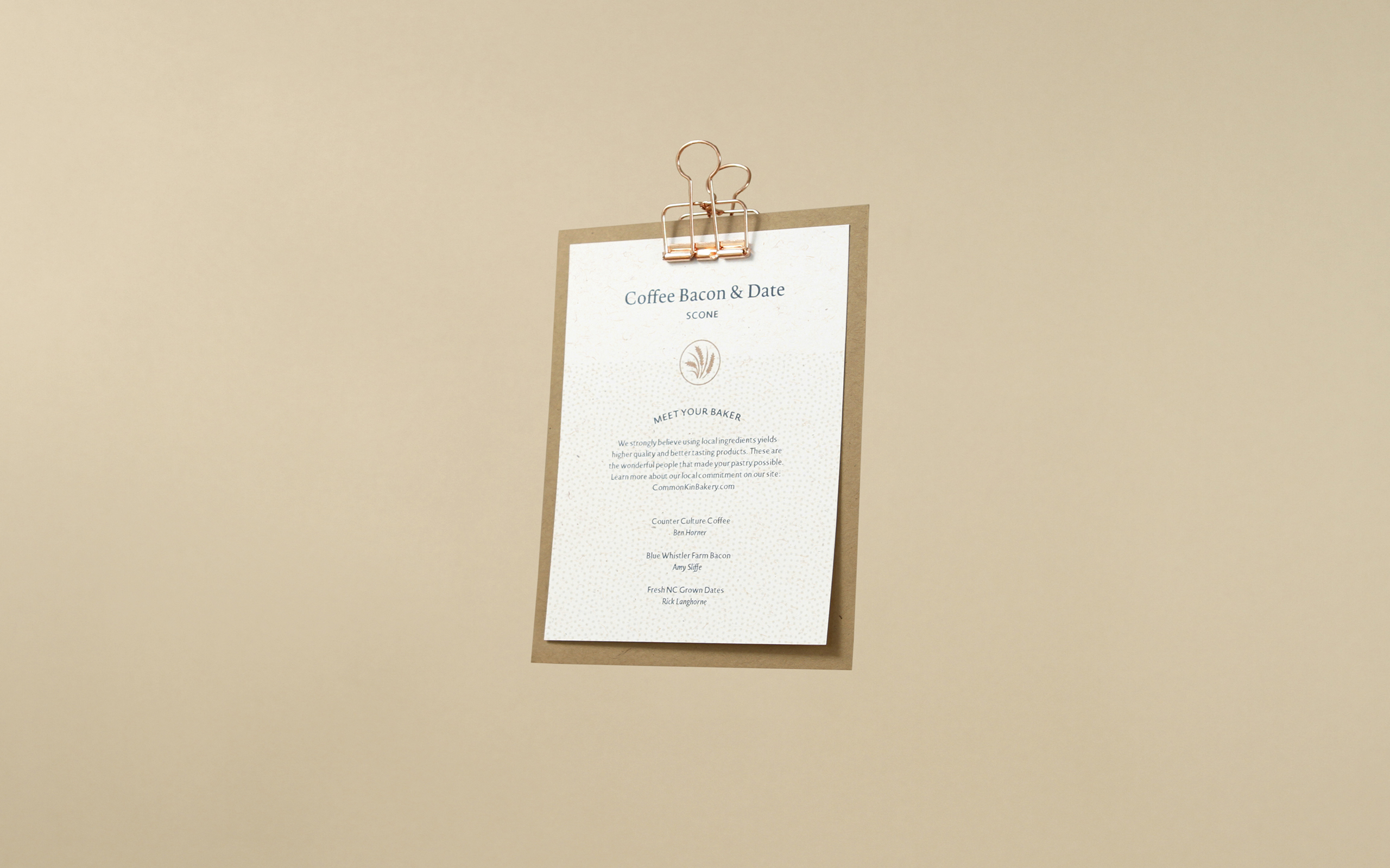
Client: Common Kin
Studio: Twin Forrest
Details: Branding
Client: Tipofili
Logotype: Andy Anzollitto
Details: Branding, Motion Design, Web Design, Web Development
Client: Pisellino
Studio: Louise Fili Ltd
Art Direction: Louise Fili
Design: Louise Fili and Matthew Smith
Details: Branding
Client: Bettina
Studio: Louise Fili Ltd
Art Direction: Louise Fili
Design: Louise Fili and Matthew Smith
Details: Branding

Client: The Daily Heller
Studio: Louise Fili Ltd
Art Direction: Louise Fili
Design: Louise Fili and Matthew Smith
Details: Branding, Motion Design

Client: Common Kin
Studio: Twin Forrest
Details: Branding
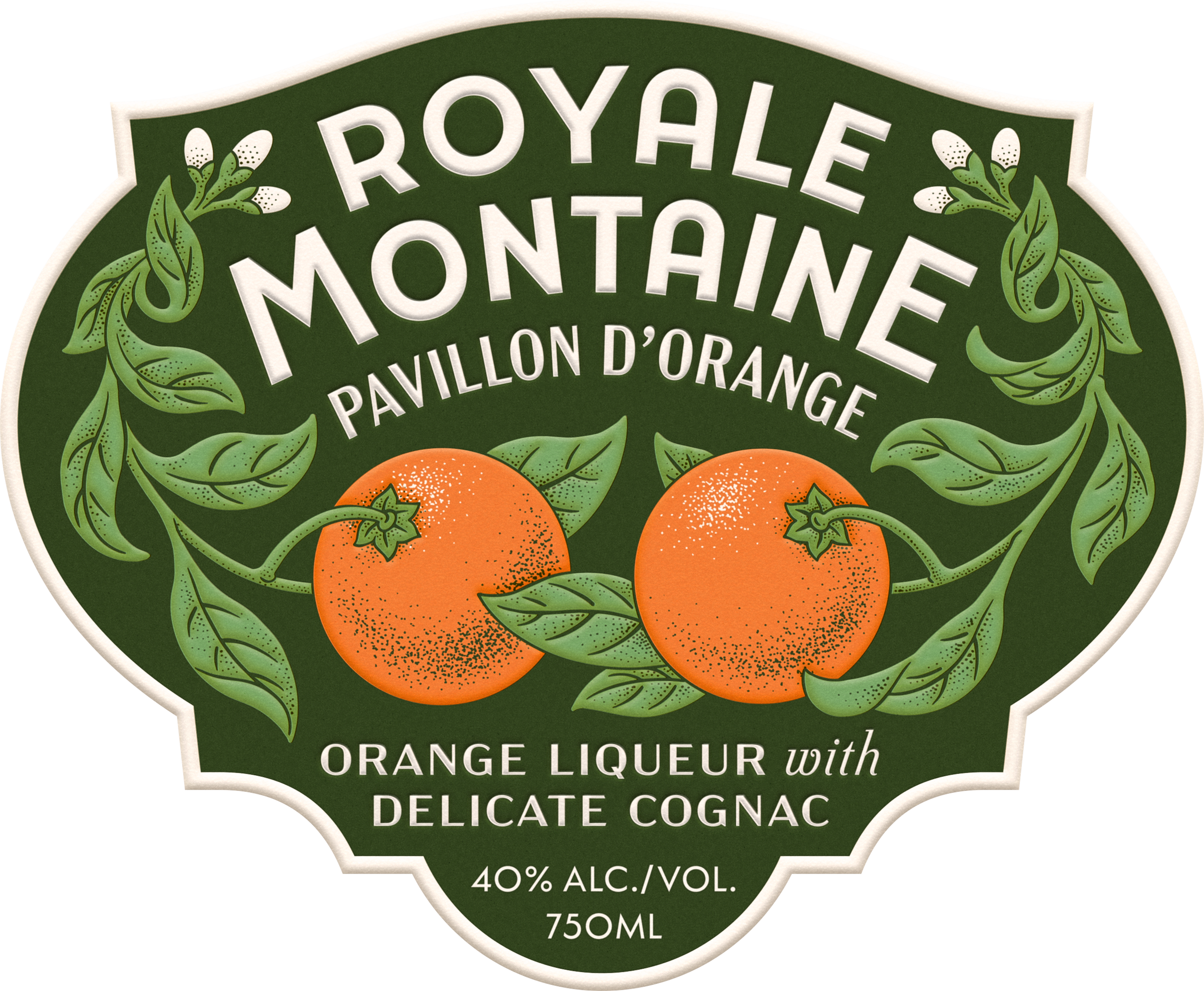
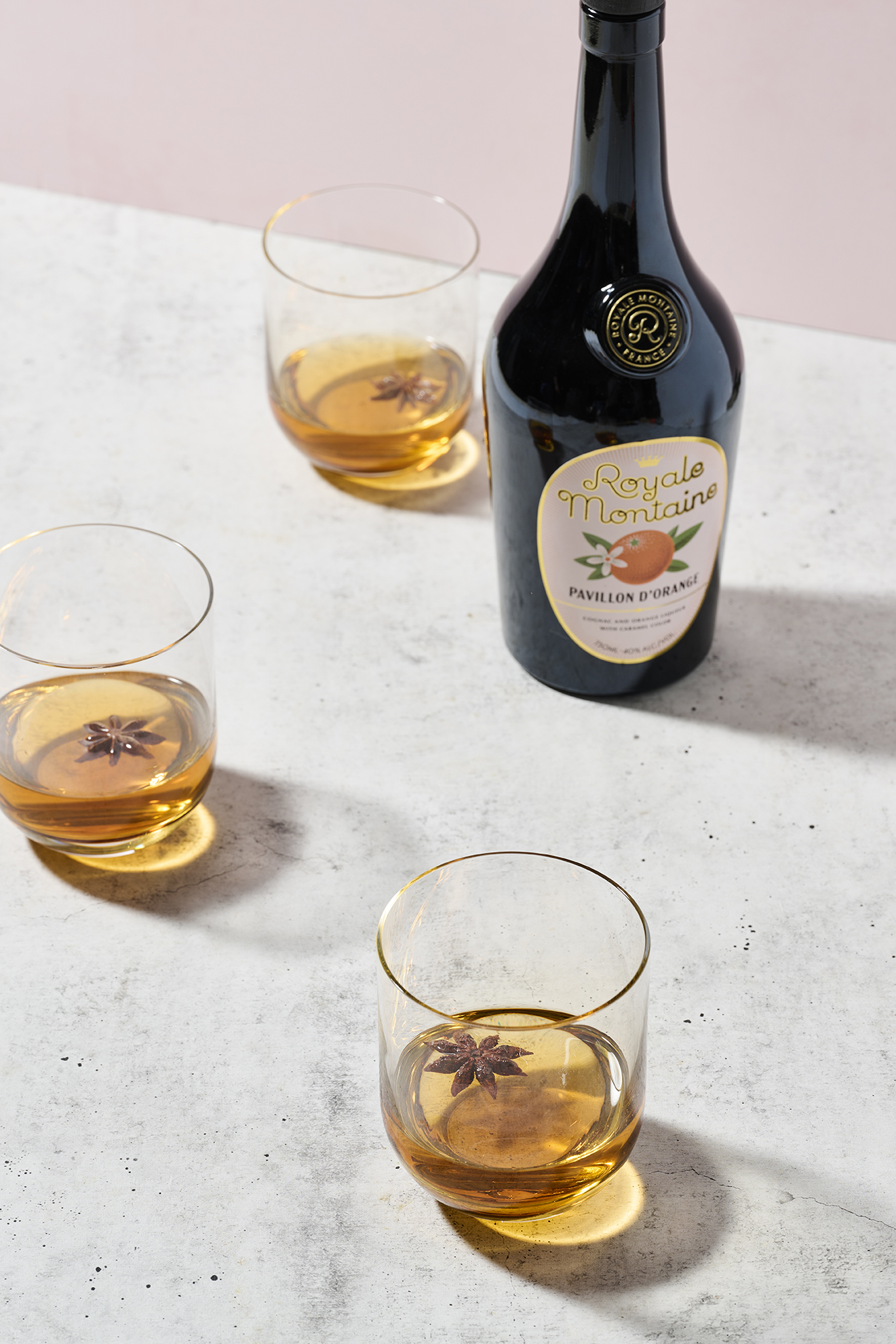
Client: Royale Montaine
Studio: Louise Fili Ltd
Art Direction: Louise Fili
Design: Louise Fili and Matthew Smith
Details: Unused Label Direction, Custom Type, Illustration
Client: Theory11
Project: Navigator Playing Cards
Details: Illustration, Lettering, Packaging
Client: Common Kin
Studio: Twin Forrest
Details: Branding
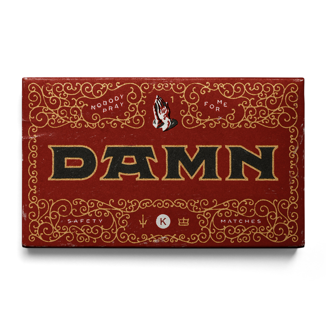
Client: Personal
Details: DAMN, Favorite Albums of 2017
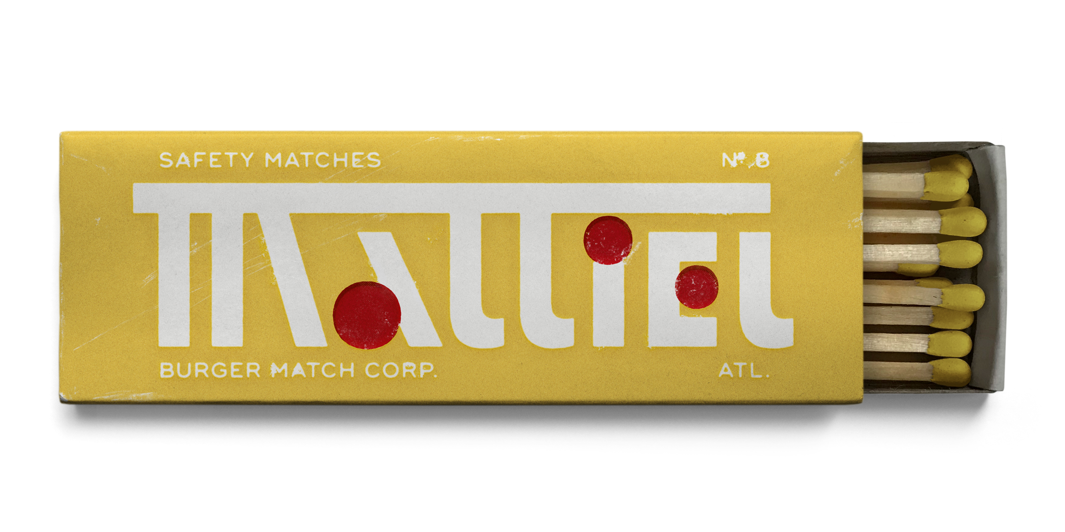
Client: Personal
Details: Mattiel, Favorite Albums of 2017
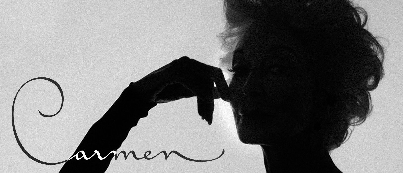
Client: Carmen
Studio: Louise Fili Ltd
Art Direction: Louise Fili
Design: Louise Fili and Matthew Smith
Scope: Title Sequence
Client: Christina Juarez & Company
Studio: Louise Fili Ltd
Art Direction: Louise Fili
Design: Louise Fili and Matthew Smith
Engraving: Nathan Yoder
Scope: Branding, Illustration
Client: Royale Montaine
Studio: Louise Fili Ltd
Art Direction: Louise Fili
Design: Louise Fili and Matthew Smith
Details: Branding, Packaging
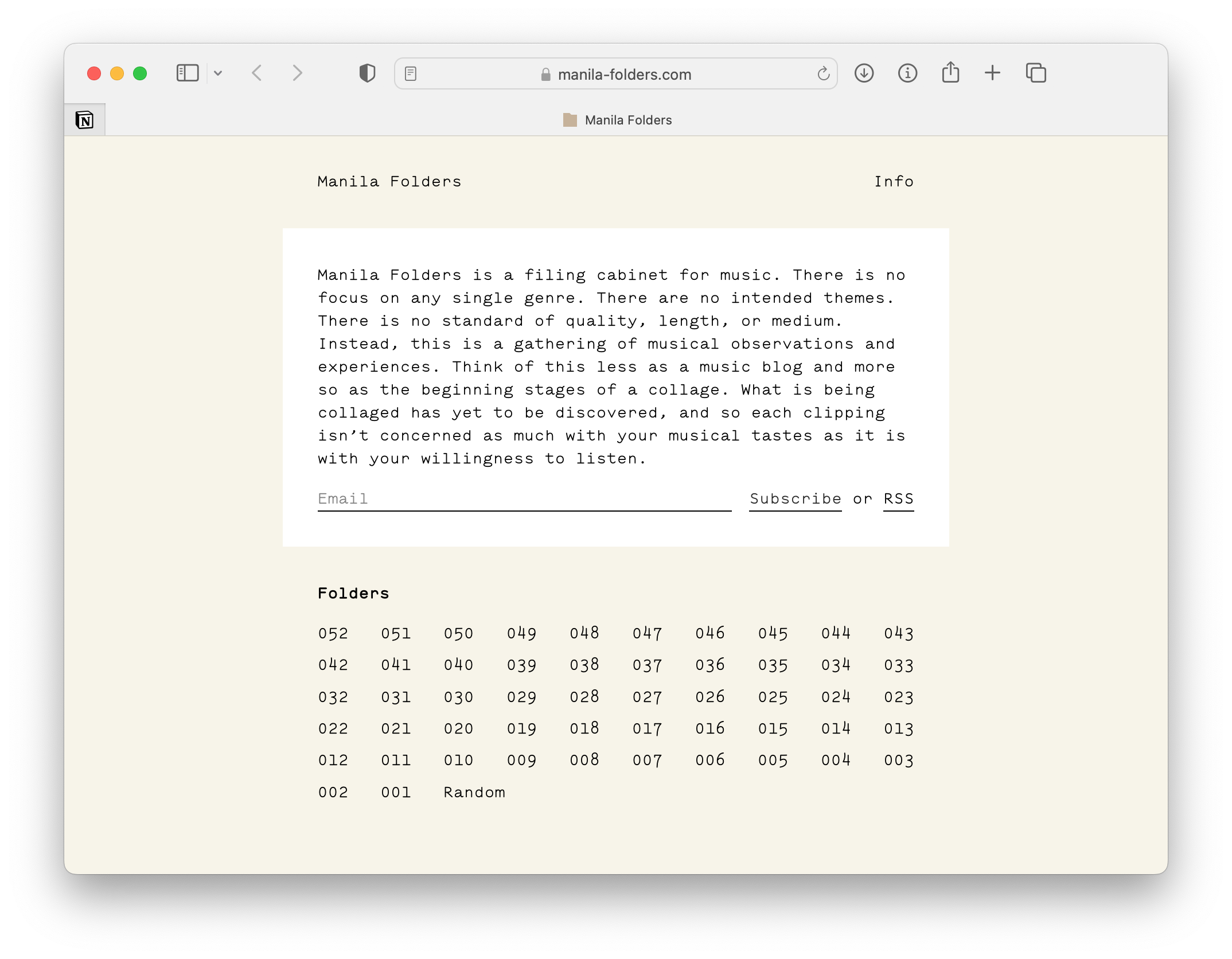
Client: Personal
Project: Manila Folders
Details: Web Design, Web Development

Client: Royale Montaine
Studio: Louise Fili Ltd
Art Direction: Louise Fili
Design: Louise Fili and Matthew Smith
Details: Illustration
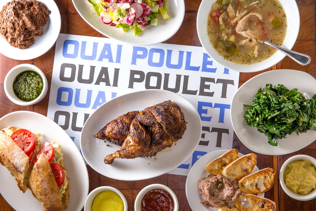
Client: Poulet Sans Tête
Studio: Louise Fili Ltd
Art Direction: Louise Fili
Design: Louise Fili and Matthew Smith
Details: Custom Type

Client: Tipofili
Details: Custom Type

Client: Royale Montaine
Studio: Louise Fili Ltd
Art Direction: Louise Fili
Design: Louise Fili and Matthew Smith
Details: Branding
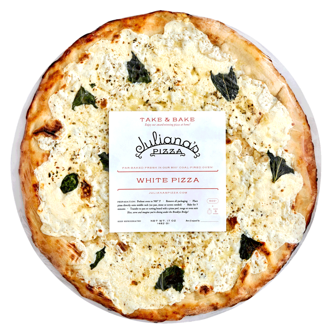
Client: Juliana’s
Studio: Louise Fili Ltd
Art Direction: Louise Fili
Design: Louise Fili and Matthew Smith
Details: Packaging
Client: Via Carota
Studio: Louise Fili Ltd
Art Direction: Louise Fili
Design: Louise Fili and Matthew Smith
Details: Packaging
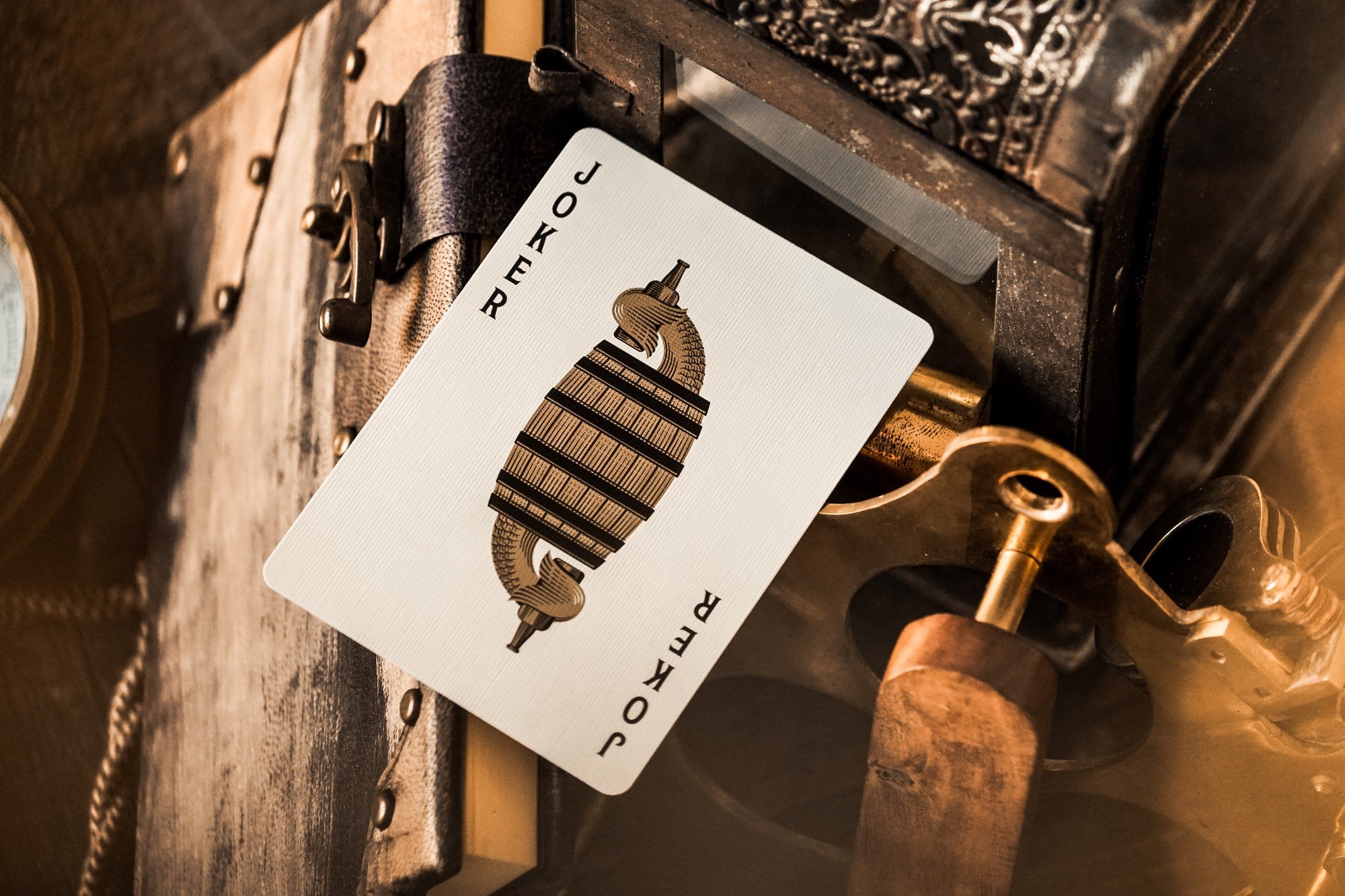
Client: Theory11
Project: Navigator Playing Cards
Details: Illustration, Lettering, Packaging
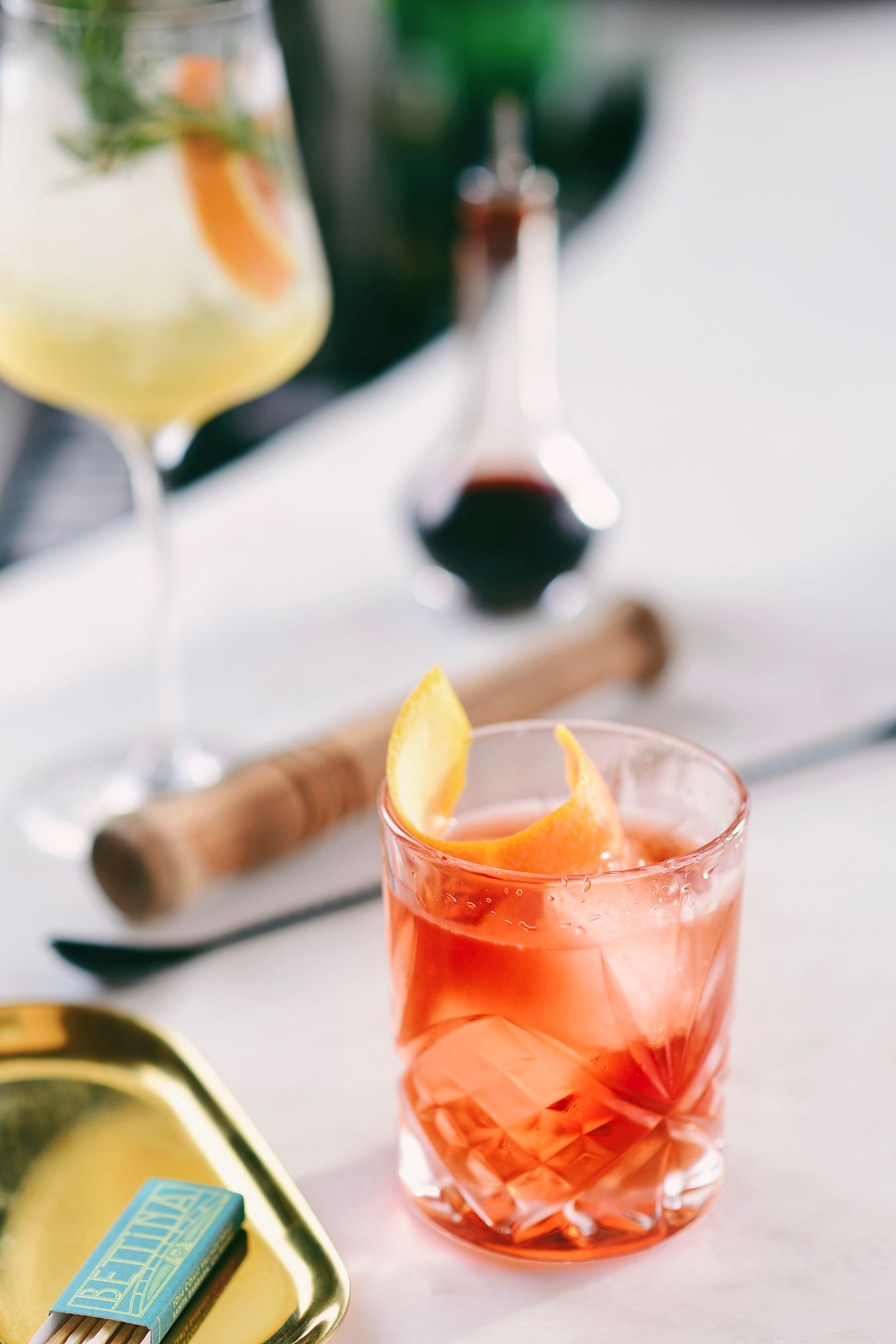
Client: Bettina
Studio: Louise Fili Ltd
Art Direction: Louise Fili
Design: Louise Fili and Matthew Smith
Details: Branding

Client: Common Kin
Studio: Twin Forrest
Details: Branding
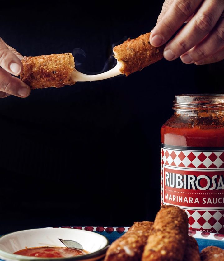
Client: Rubirosa
Studio: Louise Fili Ltd
Art Direction: Louise Fili
Design: Louise Fili and Matthew Smith
Details: Branding, Packaging

Client: Postino
Details: Logotype
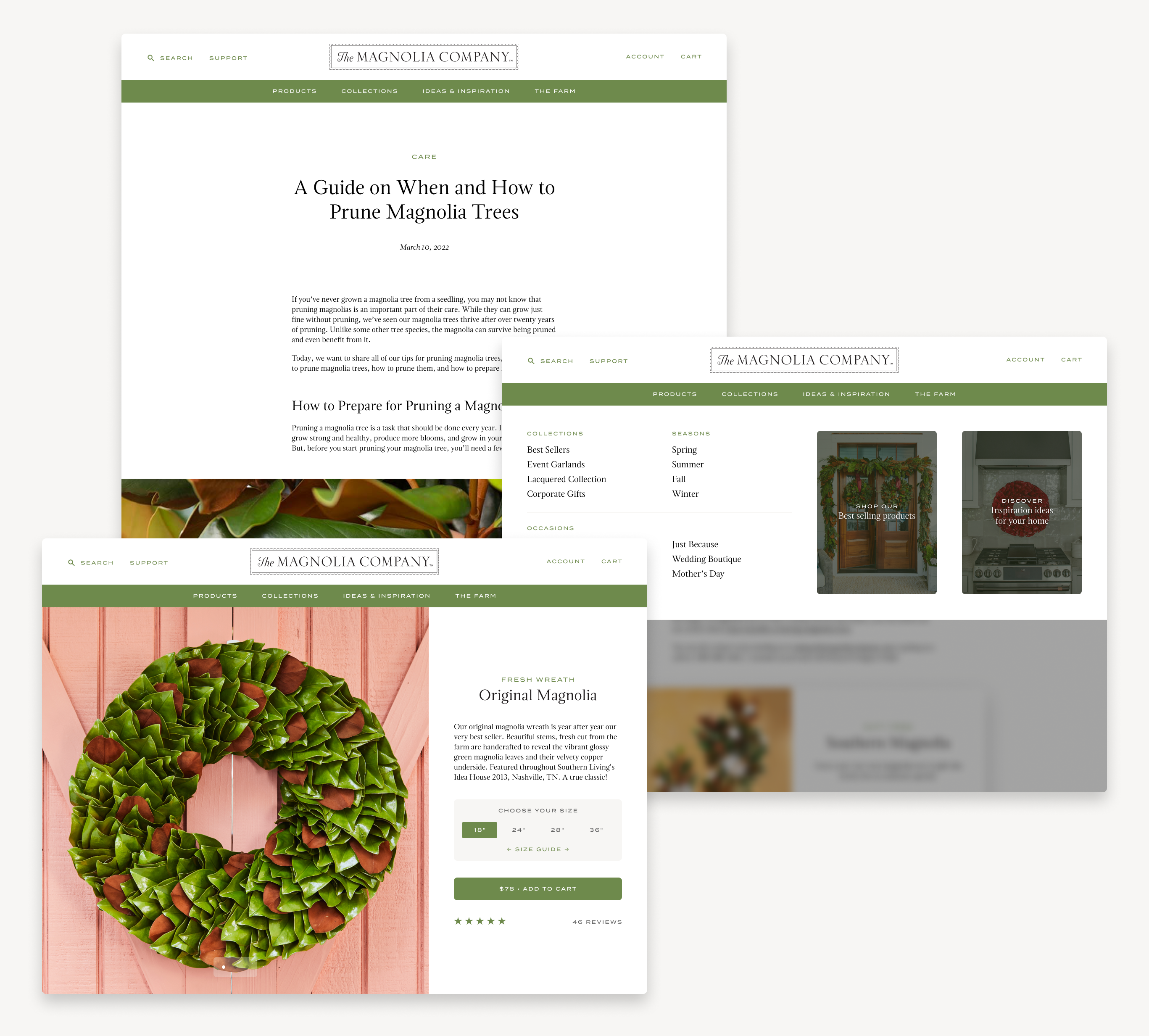
Client: The Magnolia Company
Studio: Louise Fili Ltd
Art Direction: Louise Fili
Design: Louise Fili, Andy Anzollitto, and Matthew Smith
Details: Branding, Web Design

Client: Bar Suzette
Studio: Louise Fili Ltd
Art Direction: Louise Fili
Design: Louise Fili and Matthew Smith
Details: Branding, Illustration
Client: Pistone
Studio: Louise Fili Ltd
Art Direction: Louise Fili
Design: Louise Fili and Matthew Smith
Details: Branding

Client: Bar Suzette
Studio: Louise Fili Ltd
Details: Branding, Illustration
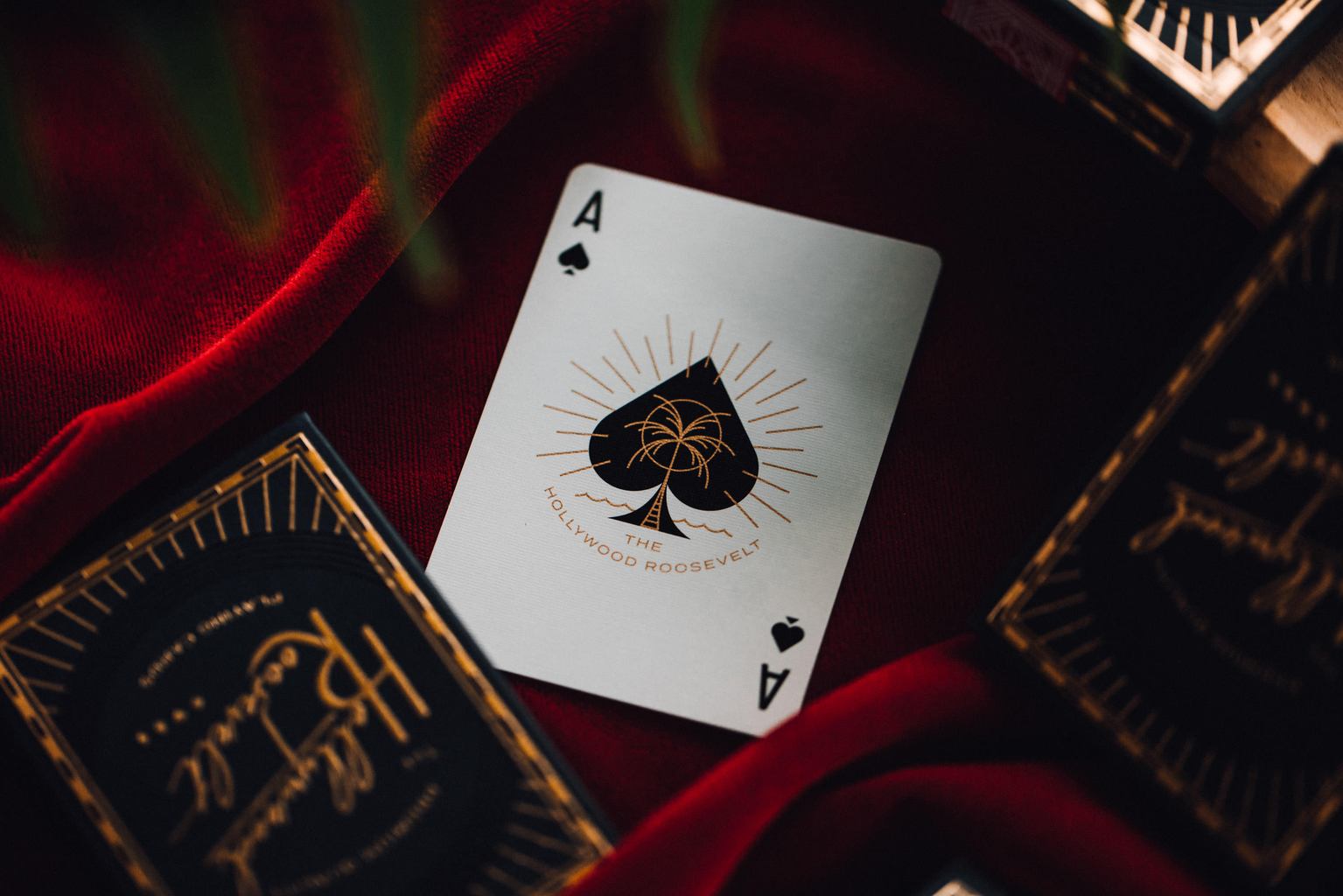
Client: Theory11
Project: Hollywood Roosevelt Playing Cards
Details: Illustration, Packaging

Client: Rubirosa
Studio: Louise Fili Ltd
Details: Unused Logo Direction
Makeshift Tools
Likely a byproduct of my skateboarding days and growing up with a jack of all trades dad, I tend to build things. Scrappily build things. As kids we built makeshift ramps out of whatever we could get our hands on, and my dad eventually taught me how to weld. Which is to say that at a young age I learned how to improvise. More so, I learned how to learn.
Now I find myself building makeshift tools and resources to aid in my design process which, in turn, has helped me become a better communicator when I am out of my depth.
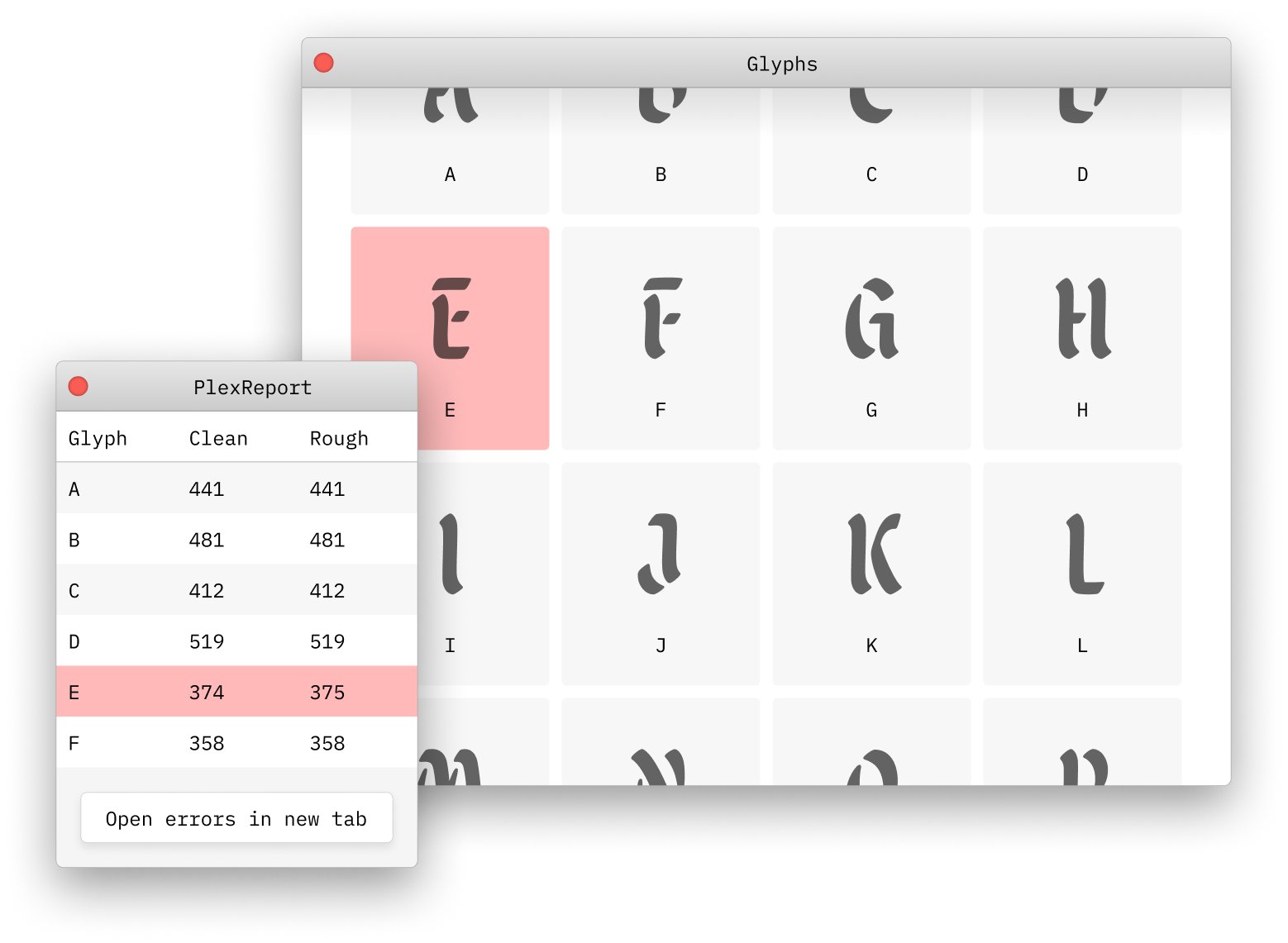
Originally built during the production process of Malice, a font by Scott Biersack, I created PlexReport, a Glyphs App plugin to report if glyph widths match across the masters. This comes in handy when working on multiplex fonts where characters are the same width across weights but each individual character is spaced proportionally.
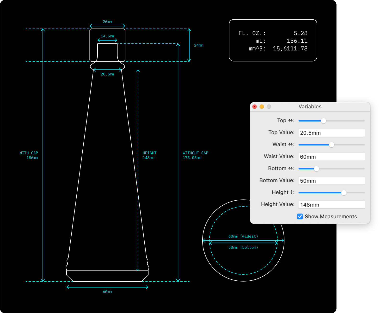
While working on the packaging for a hot sauce company, they wanted a bespoke bottle. The only problem was, I am not an industrial designer, I didn’t have access to any industrial design tools, and the client didn’t have a production team to work with. Rather than throw in the towel, I worked with what I knew.
I wrote a Python script to help us determine the dimensions of the bottle while taking into account the thickness of the glass. This allowed us to play with the width and height, and monitor the volume of the bottle. While the design would eventually be handed off to an industrial designer to finalize, this allowed us to quickly iterate on the bottle without the endless back and forth from the production team (which wasn’t even contracted yet).
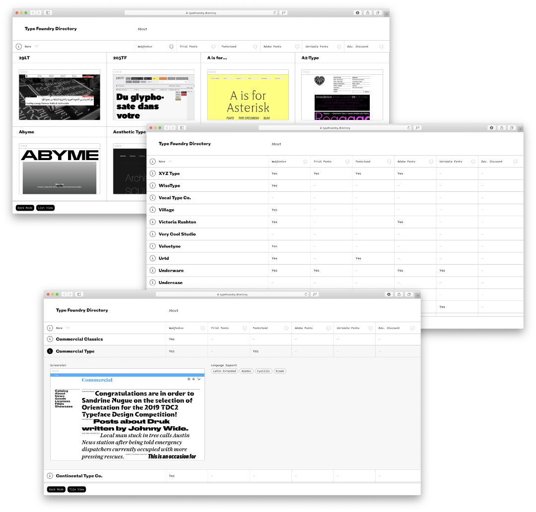
In 2018 I was fed up with my bookmarking system for type foundries. I wanted a database I could reference that included the information I like to know when browsing foundries and their fonts so I created the Type Foundry Directory. I have been working on a massive update to the directory which I am aiming to push live later this year.
Type Design
My design practice is largely rooted in typography, and given such, learning how to draw and engineer type felt imperative to knowing how to work with it on a deeper level. Over the years, the inverse has been equally true—my exhaustive use of typography directly informs how I draw and develop typefaces.
In 2020, I founded Morning Type as a space to house my type design work, and in 2022 I co-founded Tipofili alongside Louise Fili and Andy Anzollitto. Below is a very small sampling of the fonts I have in progress.

Gait Serif is in line to be Morning Type’s first retail release this year. It is a reinterpretation of Philip Kelley’s “Cortez” from the 1970s. Rather than simply digitizing Cortez, Gait attempts to reposition this font—whose usage intrinsically tied it to sci-fi books and rock ’n roll albums—as a contemporary editorial font.

Bolzano* is a revival and expansion of the elusive Virgilio from the Nebiolo company, one of Italy’s great type foundries from the 20th century. This is currently in development for Tipofili to be released in 2023. Bolzano is set to come in a range of weights and optical sizes—the display cut being shown above.
*Temporary name

Spare is another editorial serif which draws inspiration from 70s advertising and photo lettering. The narrow proportions make it economical for typesetting headlines without being uncomfortable to read. It brings the familiarity of Times New Roman without the ubiquity.

Portofino is a charming display typeface with expressive forms that complement its underlying geometric proportions. Influenced by Italian hand-lettered posters from the early twentieth century, the font supports an extensive array of swashes and stylistic alternates true to the quirky variety of the reference material. It is available for licensing through Tipofili.

Still untitled, this display serif is just one of many styles. Pulling from a handful of Old Style faces from the late 19th century, this has become an ambitious attempt to bring their many characteristics from weight, width, and optical size into a single family.

Like holes punched into a cardboard box which makes the suggestion of a face, this sans searches for quirkiness in the mechanical. Originally inspired by this sign, as I began expanding it to stretch across multiple widths and weights, the font became a love letter of sorts to The Pyte Foundry’s Triptych Grotesque and Commercial Type’s Styrene.

Course is a Deberny & Peignot Egyptian masquerading as a clarendon. This font is no doubt inspired by DJR’s Job Clarendon, XYZ’s Ballast, and Commercial Type’s Thorowgood family.
Thank You & Colophon
A few friends were surprised I was adding a thank you section to my portfolio, but as someone who is extremely transparent, I strongly believe in giving credit. And couldn’t we all express a little more gratitude? So first, thank you for taking the time to read this.
Thank you to Louise for everything you have taught me, and for trusting and challenging me over these years. I am glad we can continue to foster our relationship through Tipofili. Thank you to Matt Yow and Sam Stratton for helping kick start my career at Twin Forrest. Matt has been a great friend over these years, constantly being a source of encouragement. Most of all, thank you to my partner Kara for your constant love and support.
While “The Design Practice of [Insert name here]” is hardly ownable, I must say that after seeing it on David McGillivray’s site, I thought to myself, “I like that! Maybe I’ll use that.” (So thank you, David!)
The ol’ “preserving the poetry” bit was influenced by Smith & Diction—which Mike then said was inspired by Wabi-Sabi.
The body copy is all set in Blanco by Dave Foster. I will forever and always gush over this font. It is truly one of the most well drawn contemporary serif fonts. The headings are set in Successor, “a faithful take on the 19th century Egyptian” by Tim Ripper of Commercial Type.
Let’s get in touch
You can reach me via email:
hi@matthewsmith.website